CISRS have today unveiled a range of new logos to help modernise their branding and have announced a planned re-design of the CISRS website.
The new logos have been reportedly designed in-house that incorporates the company’s colours orange, black and white.
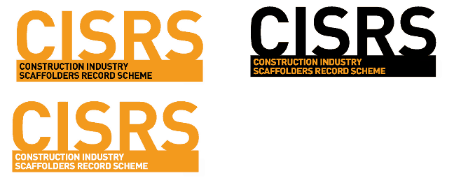
The range of logos includes:
* Orange logo with black company name,
* Orange logo with white company name, and
* Black logo with orange company name.
The new logos will be forwarded to CISRS training providers initially and then rolled out throughout the rest of the year, with a view to complete integration in early 2016.
CISRS Scheme Manager Dave Mosley said: “We have had the old silver and white CISRS logo for many years now and felt the time had come to modernise and bring it into line with the orange, black and white designs of our advertising campaigns. The rotation of the colours will provide a “home and away strip” scenario and will be helpful particularly if the training providers wish to use the new logo alongside their own corporate colours or branding.
“We are aware the integration of a new logo can take time to achieve, but hope that by the early part of 2016, everyone will be using the new designs, and that they will be well-received by the scaffolding, training and wider construction industries. The CISRS website, which will also be receiving a re-vamp, will include the new logos.”


